Here is a link to my Presi evaluation:
http://prezi.com/v_2mmxyz1ju0/a2-media-evaluation/?kw=view-v_2mmxyz1ju0&rc=ref-28742819
Friday, 21 December 2012
Thursday, 20 December 2012
Video
And I now present our video trailer for Slender, straight from Vimeo:
Slenderman Trailer from MonkseatonMedia on Vimeo.
Slenderman Trailer from MonkseatonMedia on Vimeo.
Tuesday, 11 December 2012
Website homepage
Another one of the ancillary products I was required to make was a website homepage. I needed to conduct some research and look at a couple of film website homepages and talk about them, such as what they contain, for example, the colour scheme and the tone.


These are the first two draft ideas of my website homepage, shown in a very simple way. As seen in the images, it shows what goes where, naming it. My first idea shows a very traditional idea of a website homepage, with the buttons down the side, the title logo at the top and a relevant image in the top-left corner. My second idea shows a more unique idea, with a large image taking up most of the page. Underneath go the buttons and further below are the company logos.


The next two drafts show the same ideas, but this time they show what the homepage will look like. On these ideas, I said what each button is: button 1 is 'home', 2 is 'the film', 3 is 'gallery', 4 is 'news/reviews', 5 is 'trailer' and 6 is 'cast & crew'. The image shows the Slenderman standing in the forest with the Slender logo overlaid.
Here is a large image of the Slender website homepage. For reasons unknown, the background as shown in the image below will not appear on the link. This is why I have inserted an image of what the website actually looks like.

Tuesday, 20 November 2012
Poster
One of the ancillary products I was required to make was a poster. Firstly, I needed to conduct some research and look at several posters and talk about the types e.g. teaser, billboard and what they generally contain e.g. credits, company logos etc. When I started to make the actual poster, I first had to make some rough drafts. I had two ideas - a teaser poster showing Slenderman standing in the woods all alone and a main poster based on the notes found in the game.


These first two drafts showed the poster ideas in their most simplistic way. It basically showed where the things in the poster went, simply saying what it is in a box.


These other two drafts were still the poster ideas, but this time drawn up, to see what they actually looked like. Obviously, on the first poster, it still says 'credits' where the credits would normally go. The reason for this is because I couldn't really be bothered to write out of the people's names and what they did, mostly because it would waste time.
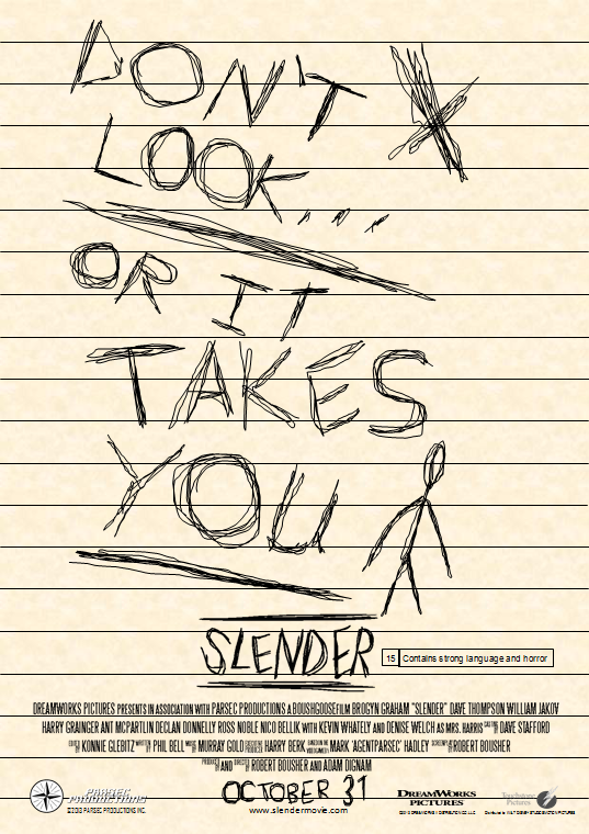
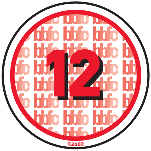
This is the proper version of the poster, done on Microsoft Publisher. As you can see, it is based on the notes found in the game. What I did to do the tagline 'don't look...or it takes you' was that I used the 'scribble' selection on the shapes tool. I also did the same thing with the release date 'October 31'. The background was done using a texture already installed into Microsoft Office and the lines were just done using lines, split apart every 1.5 centimetres (or whatever it is). I also put in the Slender logo, which wasn't created by me, with the background removed and the BBFC rating (15) and what it contains.

I also made a variant of the poster, which wasn't really the intention. All I simply did was paste the original variant into Paint. But then, for the hell of it, I inverted the colours. I showed Adam what it looked like and he really liked it, saying that it looked it was written on a chalkboard. Everything is essentially the same, but the colours are just inverted, there have been no changes at all.
Friday, 16 November 2012
Credits font
As we all know, most film posters use practically the same font for their credits at the bottom. I think they might use this particular font so they can fit the credits at the bottom. The font I used for the poster credits is Steel Tongs.


There were a one font I did have look at called SF Movie Poster. I downloaded it at home and used it on my poster when at home, but it didn't actually look like Steel Tongs, so I didn't use it.

Friday, 26 October 2012
Film ratings
Obviously, our film needs to have a BBFC rating and the most common of these are the over-PG ratings 12, 15 and 18. Me and Adam have been thinking and we've decided to go for a 15 certificate, because despite the fact there is no extremely gory and/or s*xual content, if we did actually make a film lasting 90 minutes, there would potentially be a lot of foul language, e.g. f**k.
 The 12 rating is a very uncommon certificate for horror films. Most genres that go towards 12's are action, thriller, teen comedies, mature cartoons (e.g. The Simpsons) and superhero films. In terms of mature content, sexual content can only be brief and discreet, moderate language can be used (strong language may be used only once or twice) and violence can be moderate, but not putting emphasis on injury detail. Blood can be used, as long as it's not extremely gory (for example, blood featured in the final Lord of the Rings film when Gollum bit off Frodo's finger). The only horror films classified 12 upon cinema release include Van Helsing and The Woman in Black, possibly because it didn't have much in the way of blood and the level of violence.
 The 15 rating is a fairly common certificate for horror films. 15 rated films (whether it's horror or action) usually contain occassional bits of gore, for example, Hot Fuzz contains lots of gory scenes. Strong language can also be used, but the strongest forms can also be used, as long as it's appropriate. Horror films that are classified 15 include Drag Me to Hell, The Shining, The Ring and its sequel, The Ring Two.

The 18 rating is the most common certificate for horror films. 18 rated films show extremely mature content that is for adult viewing only (so that's appropriate for some of us). In 18 rated films, s*xual content, violent content and foul language will be very strong and frequent, but because our film would not have the first two of these if it was filmed completely, this wouldn't be the rating we would go for. Horror films that are classified 18 include The Thing (1982), Alien, Friday the 13th and its many sequels.
Thursday, 25 October 2012
Filming plan
Me and Adam have decided on a filming plan. We planned that we will film Monday 29th October, Tuesday 30th October, Friday 2nd November and Tuesday 6th November. The following list is what scene we're going to film on these days:
- 29th October - quarry
- 30th October - car scene
- 2nd November - underpass
- 6th November - bedroom scenes
Wednesday, 17 October 2012
Storyboard
The following five pictures show the storyboard, which was created by Adam and a little bit of contribution by me early on until I was told to make the script. As shown, there are 10 boxes on each page, so 50 boxes had do be filled in. Adam had to draw what the shot was expected to look like and say what type of shot it is, as well as if there was any dialogue, camera movement and sound and how long each shot was expected to last. Usually, each box on a storyboard lasted 3 seconds (which, obviously, it doesn't have to) and 50 boxes means that it would last 150 seconds (2 and a half minutes). Of course, each box isn't actually going to be the exact shot; some shots may have to be different.


Tuesday, 16 October 2012
Script
After about four lessons, I have now completed the script, while Adam has finished the storyboard. Below is the script for the trailer. This was originally meant to be put up on here as a link so it can be viewed in Microsoft Word, but I don't know how to do that, so I thought I'd just copy the entire script in here.
Slender trailer
(DreamWorks Pictures logo in grey)
1
INT. DARK ROOM:
(a dark room with
‘DreamWorks Pictures presents’ overlaid; the door open ajar. Suddenly, a shadow
passes through the light as the door closes. The door finally shuts completely.
‘A Parsec Productions film’ appears as the door shuts.)
2
EXT. TREES:
Part 1
(a girl runs through a
tree-filled area, panicking, breathing heavily as she runs)
Part 2
(the girl standing in the middle of
the forest looking fearful. The legs of a tall figure stand behind her*.) *When
the girl stands in the middle of the forest, the camera pans around 720
degrees.
Part 3:
(the girl notices something by a
tree. She sees a sheet of paper saying ‘don’t look…or it takes you’.)
Part 4:
(the girl is back in the forest,
hiding behind a tree, shaking and breathing heavily. Suddenly, a hand grabs
around the tree.)
Part 5:
(suddenly, the tall figure’s body
peers around the tree. The faceless head lowers slowly and quickly faces the
girl.*)
*Jumps to black as soon as
the figure makes contact.
3
INT. CAR:
(On the phone, in the car)*
(you don’t hear the boy) *This dialogue will be split apart to produce more
than one part of the trailer.
GIRL (terrified)
Come on! Pick up, pick up!
BOY (unheard)
Hello?
GIRL
*exhales* I-I-I think I’m b-being followed.
BOY (unheard)
Wha’? What are you on about?
GIRL
I said I think I’m being followed.
BOY (unheard)
Whoa, slow down. You keep stuttering. What are you trying to
say?
GIRL (calmer)
I’m being followed.
BOY (unheard)
Who by?
GIRL (increasingly panicky)
I don’t know!
BOY (unheard)
Wait, wait. Calm down. I’m home in a few days.
GIRL (slightly calmer)
Yeah. Yeah. Do you believe me?
BOY (unheard)
Umm…
GIRL
Do you believe me?
BOY (unheard)
Uh, yeah.
(the girl hangs up. Suddenly, the
car swerves violently and the girl hits her head off the steering wheel.*)
*This cuts to black afterwards.
(After a few seconds, the girl starts
to wake up. A shadow passes the car but the girl doesn’t notice as she’s stirs.)
4
INT. GIRL’S BEDROOM:
(the girl stands at her desk in her
bedroom looking down at the notes she picked up from the trees.)
5
INT. CORRIDOR:
Part 1:
Part 1:
(the girl runs down the
corridor, followed closely behind by a tall figure.)
(Suddenly, the girl stumbles
and the tall figure leans down to grab her*.)
*During this scene, there
are a lot of jump cuts to black
Part 2:
(The girl is still running
with the tall figure getting closer.*)
*This jumps to black.
6.
LOGO AND CREDITS:
(Slender video game logo
wipes across with a glimmer of light in its usual sketched design. A huge flash
appears, soon goes away and the logo reappears along with a zodiac symbol, as
if carved into wood. The logo and symbol fades out)
(the film’s release date,
URL and credits appear, along with the DreamWorks Pictures and Parsec
Productions logos)
Wednesday, 10 October 2012
Production companies
 Obviously, a film needs to have production companies to help out with the film. Of course, I already Parsec Productions, the company who do the game, as the production company. I just really needed to choose distributor(s), because a film isn't a film if it isn't distributed by a big name movie studio like Warner Bros. or Paramount Pictures.
Sunday, 7 October 2012
Target audience
Our film trailer obviously needs a particular target audience. This post describes what target audience suits our trailer. There are eight types: thinkers, believers, achievers, strivers, experiencers, makers, innovators and survivors.
I think one of the target audience's for our film trailer is survivors. This is because our film is based on a survival horror game and shows the main character trying to avoid being captured by a creature. It basically shows the character desperately trying to survive. Our film gives a clear view of survival by showing the character deeply concerned for their safety and finding several hints in order to survive, particularly the notes.
Another target audience for our film would be thinkers. This is because our film's is a psychological horror and her experience with encountering the antagonist will stimulate her brain and has to try and think on how to beat the antagonist and survive, for example, phoning her boyfriend to see if he'll help.
A third target audience for our film would be achievers. This is because the main character is trying to achieve her goal of surviving the Slenderman.
Saturday, 6 October 2012
Trailer analysis
Because I am creating a film trailer, I have been required to research film trailers. There are several factors that are consistent throughout film trailers:
This trailer starts off with everything happy as it shows the 5 main characters getting into their motorhome. This is to 'disguise' the actual genre of the film, trying to get the audience to, at first, assume that the film is a teen movie. The tone of this trailer suddenly changes when the Lionsgate logo appears on a blood-red sky and the upbeat music ends suddenly as the characters stop off at a dilapidated petrol station owned a sinister man, starting to create the sense of horror. The text in-between clips makes the audience feel uneasy. It is in a white serif font on a dark background with hexagons and it flickers, clearly indicating that it is a horror film. The main premise of the film appears to begin when a bird is obliterated completely by an invisible forcefield, meaning that the cabin (in the woods) is sealed off from civilisation. The horror really starts to begin when a clip of the petrol station owner shows his true nature saying, 'The lambs have passed through the gate. They have come to the killing floor.' This is used to raise suspense. To surprise the audience, the music in the trailer stops so that the only sound heard is the hushed voices of the characters until something loud happens, namely in this trailer, a fist suddenly punching through a wall. The end of the trailer shows the factors generally used in horror film trailers: the stereotypical clips in quick succession and voiceovers of characters screaming or yelling. The music used over this part of the trailer is really effective because the drum beats emphasise the horror and drama of the film.
Sinister:
- Music
- Text in-between clips
- Company logo
- Voiceover
- Heavy editing e.g. dubbed voice from clips over other clips
- Website address
- Release date
- Title logo
- Clips in quick succession might emphasise drama
- Monologues for effect
- Voiceovers of characters yelling and screaming to heavily emphasise drama
I am going to analyse two horror film trailers. The first one is for The Cabin in the Woods and the second one is for Sinister.
The Cabin in the Woods:
This trailer starts off with everything happy as it shows the 5 main characters getting into their motorhome. This is to 'disguise' the actual genre of the film, trying to get the audience to, at first, assume that the film is a teen movie. The tone of this trailer suddenly changes when the Lionsgate logo appears on a blood-red sky and the upbeat music ends suddenly as the characters stop off at a dilapidated petrol station owned a sinister man, starting to create the sense of horror. The text in-between clips makes the audience feel uneasy. It is in a white serif font on a dark background with hexagons and it flickers, clearly indicating that it is a horror film. The main premise of the film appears to begin when a bird is obliterated completely by an invisible forcefield, meaning that the cabin (in the woods) is sealed off from civilisation. The horror really starts to begin when a clip of the petrol station owner shows his true nature saying, 'The lambs have passed through the gate. They have come to the killing floor.' This is used to raise suspense. To surprise the audience, the music in the trailer stops so that the only sound heard is the hushed voices of the characters until something loud happens, namely in this trailer, a fist suddenly punching through a wall. The end of the trailer shows the factors generally used in horror film trailers: the stereotypical clips in quick succession and voiceovers of characters screaming or yelling. The music used over this part of the trailer is really effective because the drum beats emphasise the horror and drama of the film.
Sinister:
Unlike the trailer for The Cabin in the Woods, which starts off positively, the trailer for Sinister, after the logo for the distributor, Summit Entertainment, begins eerily dark and scary, showing a house from the front at night. The sound over this is near-silent to create the tension. A sudden flash on the screen along with what sounded like a screech surprises the viewer. The trailer starts to make the viewer anxious when it shows a drawing of four stick figures hanging from a tree and a police photograph of their feet. It also makes the viewer think because the previous image, a photograph of the family, shows a fifth member. The main premise of the film begins when it shows a family moving into that same house. The horror begins when the main character, a father of two, enters the attic and finds a box full of film reels. When the main character starts to watch a reel of the murdered family playing and acting happy, the viewer starts to feel fixated on the family. A screech and a quick glimpse of the family's legs hanging from a tree surprises the viewer as it is sudden. This makes the main character leap out of the chair, allowing the viewer to feel the same way as he does. It happens again when the next film reel shows a car being torched by a viewer, but this doesn't make the character jump out of his seat. The film really starts to take off when the viewer is shown quick glimpses of the film's antagonist, a supposed demonic creature, on photographs, videos and even outside the main character's window. To really terrify the viewer, as the character has the picture of the creature zoomed in, the creature turns its head towards him, while the character looks on completely unaware. Various clips such as the character's son screaming as if possessed, the character screaming, an axe dragged along the floor and zombified children in the attic have all been selected to scare the viewer. Like the trailer for The Cabin in the Woods, the text in-between clips is in a black serif font against a white marble-like background going dark around the edges with cracks around. The music is quite and eerie, adding to the horror of the film.
Thursday, 4 October 2012
Filming time decision
Today, on the way home from school (I wasn't in the Media lesson because of a clash with English; damn timetable), me and Adam agreed that we should started filming during half term. We also said we will film when its not raining; we wouldn't mind if it is dull; but not when it's even drizzling.
Friday, 28 September 2012
Slenderman research
Slenderman doesn't generally appear until the player collects the first page. Once it's appeared, it can teleport at regular intervals between randomly selected locations on the map, within a maximum range of the player, so it's out of their view. After the player collects the sixth page, it teleports in their view.
Slenderman has many abilities. For one, it can have about eight tentacles protrude from its back and shoulders, which it can also turn its arms into. Slenderman may use these tentacles to either provoke fear into the player or as extra arms and legs. Slenderman's other many abilities include time travel, camouflage, fire, sickness, mutilation, selective visibility (which means it can see who it wants to see), impersonation and Slenderwalking (the ability to appear and disappear at will). It had also been known for Slenderman to have some form of mind control. It can brainwash the victim; give them Stockholm Syndrome; or it can have mind control over the victim; turn them into Proxies; or it can have complete control over the victim; turning them into its own puppets.
Slenderman's appearance provokes a wide range of responses; particularly that of fear. It's mostly because of its towering and imposing size over a fully grown adult, which in itself copies the known fear of adults being taller than children. It's faceless and bald head might also be a factor because the thought of a person or a sentient being of any kind without a face can terrify people.
Thursday, 27 September 2012
Slender research
 Slender is a free survival/psychological horror video game released in June 2012 by Parsec Productions. It is one of those games that is occasionally updated to feature new content. Slender is about trying to escape from a terrifying creature known as the Slenderman. The game begins in a forest at night and the player is only equipped with a torch containing a battery that must be conserved. The player can't interact with any of the objects in the environment, apart from the controls which are used to walk, turning the torch on and off, picking up a page and running. The objective is to find eight notes, which are attached to various landmarks around the environment. There are nine maps, the first one being the darkened forest, five of which have already been released, with a sixth one due for release on the 27th September 2012 and two more to follow in the next couple of months. They are named Sanatorium (which is a kind of hospital), Hospice, Elementary, Mansion, Claustrophobia, 7th Street, Prison and Carnival. Because the game is updated every now and then, the ending of the version varies depending on the version.
 Tuesday, 25 September 2012
Website homepage research
The other of the two ancillary products I am doing is a film website homepage. I need to analyse the homepage of a website of a film (not a website for films like Empire). I am preferably going to analyse a website for a horror film, to see what they contain and what I can, again, 'steal' from them. I am going to look at two horror film websites: The Cabin in the Woods and The Devil Inside.

The image above shows the main menu of The Cabin in the Woods, which is simply the image of the poster, complete with the film's logo, a positive review, credits, a message to say that it's in the cinemas with the tagline underneath. There are also advertisements relating to the film in the bottom-right, Twitter messages in the top-left complimenting the film. There is also a box in the top-right that allows people to look at show times and for them to buy tickets.

Uniquely, when the user clicks 'menu', they're taken to the actual homepage, showing six links, taking allowing the user access to the film; what it's about; cast and crew; showing who's in it e.g. Chris Hemsworth and works on it e.g. Joss Whedon; video; showing 6 TV spots and 1 cinema trailer; news and reviews; showing news on the film, like what might've happened on set, as well as showing what critics thought of the film and finally, gallery; showing screenshots from the actual motion picture and when it was filmed. When the user is taken to the homepage, everything that was on the menu shifts to the left, e.g. the cabin, the 'menu' button, the film's logo and 'now playing' message. The Twitter messages and advertisements disappear. The only things that stay where they are are the brief credits at the top and the box in the top-right.
Overall, the website is structured like this to provoke fear, especially the scary, misty, tree-filled background. The background looks like this because the film is, stereotypically, a horror film set in a forest and also because the antagonist would most likely be concealed in the mist. Another thing that does this is when the website occasionally glitches, like when a TV is on the verge of failing. It's akin to when electric equipment in a horror film's setting, e.g. lights or a TV, conk out.

The image above is the homepage for the The Devil Inside. At the top of the page is some review's of the film. Below is the film's logo, with a small tagline saying that it was 'inspired by true events'. It shows the large image of a nun who looks like she got cataracts. There are also 6 links to take the user to the trailer, what the film's about, a gallery of screenshots from the film and images from filming, as well as downloading an app, getting the latest updates and something about the Paramount (who distribute the film) Premiere Pass. There is also an advertisement for the DVD of the film. Unlike The Cabin in the Woods, the website doesn't open to a button that says 'menu', instead it takes the user to the homepage. The background is black with a dark-red centre and has various chalk-like etchings. At the bottom is the logo of the distributor (Paramount Pictures) and the producer (Insurge Pictures), as well as a link to the film's Twitter and to follow it on Twitter and the film's USA rating (R).
The design of the website will scare people because of the dark and ominous background. But the close-up shot of the nun with the blurry eyes will especially get at people because of the way her face looks. The way she looks, she could be possessed by the film's antagonist.
Saturday, 22 September 2012
Poster idea
 I've now thought of an idea for my poster. The people who have heard of Slender will already know that included in the game are notes, describing what they should do if Slenderman ever encountered them. Some notes will have for example, a picture of Slenderman in the centre with the word 'no', to the left and right of him. I suggested that my poster (me and Adam have doing different posters) should be one of the notes from the game, preferably the note that says 'don't look...or it takes you'; albeit with general poster conventions, such as website URL and release date.
Friday, 21 September 2012
Extra lessons
In Wednesday's lesson, Miss Furness decided that, because me and Adam are lagging behind, we should have three independent media lessons so that me and him can catch up. Miss Furness added them in on Wednesdays period 4, Thursdays period 1 and Fridays period 3. These lessons will help because it will allow us to catch up with everyone else in the class and getting things done quicker. They are all being done outside the classroom, in the sixth form area. At present, I am working on the script and Adam is working on the storyboard.
Thursday, 20 September 2012
Poster research
As one of the two ancillary tasks I am doing is a film poster, I have been required to analyse various film posters (not necessarily comedies), to see what they contain and what I can 'steal' from them.


 Another type of posters are character-centric ones. Lots of these are released, each one showing a character from the film. These posters also act as a teaser. They contain hardly anything else; including the film’s logo, company logos, website and a message to say that it’ll be in cinemas soon. Using The Avengers as an example again, are all the character-centric posters for the film. The posters on the left all show Tony Stark (Iron Man), Thor, Bruce Banner (The Incredible Hulk), Black Widow, Captain America, Nick Fury, Hawkeye (from Thor) and Loki (also from Thor). The only things that remain consistent in these posters are the film’s logo, company logos (Paramount and Marvel), website URL and the ‘in cinemas soon’ message.


Some film posters don’t necessarily need to have their characters in but still the title logo and credits. Instead, they would use an object or setting relevant to the story. For example, on the left is the poster for the horror film, The Cabin in the Woods. It shows none of the film’s main characters, but instead shows the film’s main setting; the cabin (in the woods) arranged like a Rubik's Cube. Everything else you’d expect to find in a film poster; title logo, credits, distributor (Lionsgate) logo, rating (R), release date (April 13th) and tagline (you think you know the story); is all there. What interests me most of all on this poster is the release date. The film was released on April 13th 2012; that day was a Friday. Obviously, to tie in with the fact that Friday the 13th is deemed as a day of sheer unluckiness, Lionsgate wanted the film to be released that day and not wait until July 13th. It has been known for horror films to be released on Friday the 13th.


Other film posters have barely anything to show. This will usually act as a teaser for the new film. If it was a film adaptation of something really popular or if it was a sequel, they would use a distinctive feature from the original and/or predecessor of the sequel. It may use something famous from it. For example, on the right are two posters. The poster on the left is for the 2004 animated sequel Shrek 2. Due to Shrek’s overwhelming success, the poster simply showed no characters or credits, but a giant green 2 with Shrek’s ears, along with the producers (PDI) and distributor (DreamWorks) and release date (June 18th 2004). This was to let everyone know that this was a sequel to the most popular animated film released three years earlier. It was also because Shrek’s ears were a distinctive trademark of the series, meaning that when anyone saw them, they knew what it was associated with.
The poster on the right is for the 2012 superhero film The Avengers (or Avengers Assemble in the UK). Like Shrek 2, this poster simply showed no characters or credits, but a giant ‘A’ in a circle with an arrow included; The Avengers’ logo; as well as the producer (Marvel) and distributor (technically, Walt Disney Pictures, but Paramount Pictures’ logo appears on marketing due to transferring rights because of Disney’s purchase of Marvel) and release date (2012). This is because the film is an adaptation of a really popular superhero comic and The Avengers logo is a very well-known symbol of the series.


There are several film posters that are incredibly wide. These are only for billboards and mostly apply for films that are really popular. This particular example is from Harry Potter and the Deathly Hallows: Part 2, the last in the popular fantasy film series. These posters are obviously used to generate hype for the blockbuster film of the year and gears people up with excitement. The poster shows the central characters, Harry Potter and Lord Voldemort, engaged in a wand duel in the destroyed courtyard of Hogwarts. As they are the central characters, they are brought into the foreground. The other two major characters, Ron Weasley and Hermione Granger, Harry’s best friends, are also in the foreground but a little bit further away. Voldemort’s psychotic ‘right-hand lady’, Bellatrix Lestrange is also in the foreground as she also counts as a major character. The most interesting factor is the use of the ‘HP7 Part 2’ logo in the centre (even if the name of the series is said in the website address). Everyone knows who these characters are and clearly means that they don’t need to mention the full name of the film. The other things that remain consistent in a poster are also there; the company logos (Warner Bros. and Heyday Films), website URL, release date (7.15, which means 15th July) and a message to say that it’s also being show in IMAX cinemas.
Tuesday, 18 September 2012
Film trailer decision
 In Friday's lesson, me and Adam (it's just us two because Dom and Conor have left to go to college) finally agreed on an idea. Adam decided not to do a comedy trailer, because he thought that comedy is really hard and will be quite difficult to actually make the trailer humourous. Instead, he came up with the idea of doing a film trailer for a horror film about video game villain Slenderman from the game Slender. We decided that it should be set in a tree filled area, as that is where Slenderman stereotypically resides (he does appear in other places in the game) and that our lead star will be female. Adam also decided that Slenderman will be a CGI figure, instead of using a really tall person to stand behind the lead. It was also decided that one of the shots will be the cameraman walking around the lead slowly twice, so that once around, Slenderman isn't there and then the second time around, he is. This will be edited so that it will go fast.
Wednesday, 11 July 2012
Statement of intent
I'm working in a group of four; with Adam Dignam, Dominic Wilkinson and Conor Brockbank. We've taken the decision of doing a film trailer. We have a couple of ideas, with either the choice of doing a trailer for a comedy or an action film. We're more likely going to go for comedy, because action films have quite a lot of budget, for things like pyrotechnics, fake weapons, lighting and so on.
The two ancillary products I am going to do are a poster and a website homepage for the film. To do the research for this, I am going to look up images of posters using websites such as IMP Awards. I order to create a film poster I will use Adobe Fireworks because it has a lot of advanced tools on there, such as the magic wand, as well as the usual basic tools, such as the paintbrush to help modify pictures. When I create a website homepage, I will use Microsoft Expression Web 3 because it is really popular and is fairly easy to use.
What we need to do for our planning is to just look at examples in both fields and try to get inspiration from them.
Our intended date for creation of our main product is unknown, but Miss Furness insists that it has to be done during the summer holidays. We are possibly going to create our main product mid-summer. I'm also probably going to create my ancillary products after the summer, when we've filmed the finished product.
Of course, I am going to write up my evaluation at the end of this module - it is unknown when that'll be, however. Much like the evaluation for my music magazine work, I would first write up the evaluation on Word and then type it up again here on Blogger. It's better to write it up again because if you paste the text in on Blogger and preview it, the font for the post would be different compared to other posts.
Tuesday, 3 July 2012
Narrative
Vladimir Propp: (1895-1970):
 Vladimir Propp had the idea of the types of characters within a narrative: the hero, villain, helper, donor, princess, dispatcher and false hero. Shrek, for example, would use hero, villain, helper, dispatcher and princess. This is how it would be used in terms of Shrek:
- Hero - Shrek - he's the protagonist of the story
- Villain - Lord Farquaad - he's the antagonist of the story
- Helper - Donkey - he's Shrek's companion and friend in the story
- Dispatcher - Lord Farquaad - he sent Shrek and Donkey to rescue Fiona
- Princess - Fiona - she's who Shrek and Donkey went to rescue
 Tzvetan Todorov came up with the idea of the equilibrium, disruption and resolution narrative. For example, using Taylor Swift's music video to her 2009 song You Belong With Me, the equilibrium is the geek girl in love with the boy, the disruption is when the brunette appears and the resolution is the geeky girl wins the guy.
Roland Barthes (1915-1980):
 As well as being involved in semiotics, Roland Barthes was also involved in narrative. He had the idea of decoding narratives with his 5 codes: Hermeneutic, Proairetic, Semantic, Symbolic and Cultural. The Hermeneutic Code refers to any elements in the story that isn't completely explained and becomes to the reader. This is used to keep the audience guessing The Proairetic Code builds tension
Claude Levi-Strauss (1908-2009):
 Claude Levi-Strauss came up with the idea of binary oppositions. It is simply two terms that are the opposite in meaning. For example, it can include good vs. evil, man vs. woman or light vs. dark.
Edward Branigan (????-????):
 Edward Brannigan had the idea of a cause and effect chain of events: beginning, middle and end. He argues that narrative is 'a way of organising spatial and temporal data into a cause-effect chain of events with a beginning, middle and end that embodies a judgement about the nature of events'.
Thursday, 28 June 2012
Semiotics
Semiotics is 'the study of signs and symbols and their use of use of interpretation'. There are many people involved with this: Ferdinand de Saussure, Roland Barthes and Stuart Hall.
Ferdinand de Saussure (1857-1913):
 Ferdinand de Saussure had the idea of 'the signifier and the signified'. The signifier is basically what we see; either an object or an image. The signified is the idea we associate with the signifier. For example, a rose is a signifier, therefore the signfied idea is love, or black would be associated with either darkness, death, evil, fear and so on. The sign or symbol we see does not make sense without the actual object and the meaning it creates.
Roland Barthes (1915-1980):
Roland Barthes had the idea of 'denotation and connotation'. The denotation is the object or image placed within media texts, while the connotation is the idea we think of after we've seen the object or image, or the ideas we associate with said image. For example, if a person sees red, they'll either think of love, danger and lust, or if they thought of green, they'll either think of nature or vomit.
Stuart Hall (1932-):
 Stuart Hall came up with two theories: reception and audience, in 1981. The reception theory consists of encoding and decoding, while the audience theory consists of preferred, negotiated and oppositional. For reception theory, encoding is what is written within a media text, while decoding is an interpretation of what the image means. For the audience theory, preferred is where the reader has the idea of what is intended, negotiated is when the reader applies their own context but comes up with a similar reading to that of what was intended and oppositional is where the reader applies their own context and has a different meaning to that of what was intended.
Ferdinand de Saussure (1857-1913):
Ferdinand de Saussure had the idea of 'the signifier and the signified'. The signifier is basically what we see; either an object or an image. The signified is the idea we associate with the signifier. For example, a rose is a signifier, therefore the signfied idea is love, or black would be associated with either darkness, death, evil, fear and so on. The sign or symbol we see does not make sense without the actual object and the meaning it creates.Roland Barthes (1915-1980):
 Roland Barthes had the idea of 'denotation and connotation'. The denotation is the object or image placed within media texts, while the connotation is the idea we think of after we've seen the object or image, or the ideas we associate with said image. For example, if a person sees red, they'll either think of love, danger and lust, or if they thought of green, they'll either think of nature or vomit.
Stuart Hall (1932-):
Stuart Hall came up with two theories: reception and audience, in 1981. The reception theory consists of encoding and decoding, while the audience theory consists of preferred, negotiated and oppositional. For reception theory, encoding is what is written within a media text, while decoding is an interpretation of what the image means. For the audience theory, preferred is where the reader has the idea of what is intended, negotiated is when the reader applies their own context but comes up with a similar reading to that of what was intended and oppositional is where the reader applies their own context and has a different meaning to that of what was intended.
Introduction
Our next unit is Advanced Production. We have been given a choice of three briefs:
1. A promotion package for the release of an album, to include a music promo video, together with two of the following three options:
The two ancillary products I am going to do are a poster and a website homepage for the film. To do the research for this, I am going to look up images of posters using websites such as IMP Awards. I order to create a film poster I will use Adobe Fireworks because it has a lot of advanced tools on there, such as the magic wand, as well as the usual basic tools, such as the paintbrush to help modify pictures. When I create a website homepage, I will use Microsoft Expression Web 3 because it is really popular and is fairly easy to use.
Our intended date for creation of our main product is unknown, but Miss Furness insists that it has to be done during the summer holidays. We are possibly going to create our main product mid-summer. I'm also probably going to create my ancillary products after the summer, when we've filmed the finished product.
Of course, I am going to write up my evaluation at the end of this module - it is unknown when that'll be, however. Much like the evaluation for my music magazine work, I would first write up the evaluation on Word and then type it up again here on Blogger. It's better to write it up again because if you paste the text in on Blogger and preview it, the font for the post would be different compared to other posts.
1. A promotion package for the release of an album, to include a music promo video, together with two of the following three options:
- A website homepage for the band
- A cover for its release as part of a digipaak (CD/DVD package)
- A magazine advertisement
- A website homepage for the film
- A film magazine front cover, featuring the film
- A poster for the film
- A poster for the film
- A film magazine review page featuring the film
The two ancillary products I am going to do are a poster and a website homepage for the film. To do the research for this, I am going to look up images of posters using websites such as IMP Awards. I order to create a film poster I will use Adobe Fireworks because it has a lot of advanced tools on there, such as the magic wand, as well as the usual basic tools, such as the paintbrush to help modify pictures. When I create a website homepage, I will use Microsoft Expression Web 3 because it is really popular and is fairly easy to use.
Our intended date for creation of our main product is unknown, but Miss Furness insists that it has to be done during the summer holidays. We are possibly going to create our main product mid-summer. I'm also probably going to create my ancillary products after the summer, when we've filmed the finished product.
Of course, I am going to write up my evaluation at the end of this module - it is unknown when that'll be, however. Much like the evaluation for my music magazine work, I would first write up the evaluation on Word and then type it up again here on Blogger. It's better to write it up again because if you paste the text in on Blogger and preview it, the font for the post would be different compared to other posts.
Subscribe to:
Posts (Atom)