

These first two drafts showed the poster ideas in their most simplistic way. It basically showed where the things in the poster went, simply saying what it is in a box.


These other two drafts were still the poster ideas, but this time drawn up, to see what they actually looked like. Obviously, on the first poster, it still says 'credits' where the credits would normally go. The reason for this is because I couldn't really be bothered to write out of the people's names and what they did, mostly because it would waste time.
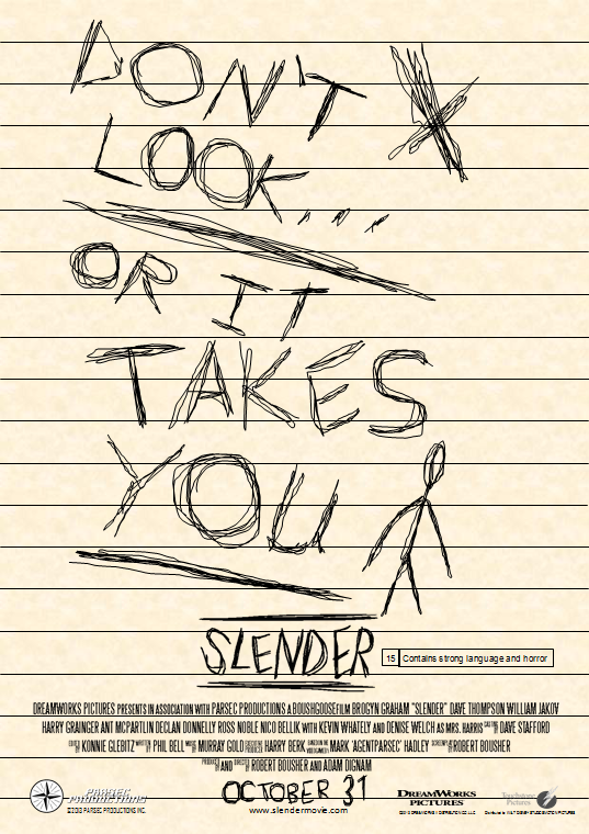
This is the proper version of the poster, done on Microsoft Publisher. As you can see, it is based on the notes found in the game. What I did to do the tagline 'don't look...or it takes you' was that I used the 'scribble' selection on the shapes tool. I also did the same thing with the release date 'October 31'. The background was done using a texture already installed into Microsoft Office and the lines were just done using lines, split apart every 1.5 centimetres (or whatever it is). I also put in the Slender logo, which wasn't created by me, with the background removed and the BBFC rating (15) and what it contains.

I also made a variant of the poster, which wasn't really the intention. All I simply did was paste the original variant into Paint. But then, for the hell of it, I inverted the colours. I showed Adam what it looked like and he really liked it, saying that it looked it was written on a chalkboard. Everything is essentially the same, but the colours are just inverted, there have been no changes at all.


